Sunday, November 28, 2010

Reminder and The Terrifying Minute...

You know the cartoon where Charlie Brown is fighting with the lawn chair? I've been stuck in that scene, only in slow motion, only with cameras. Just imagine a bunch of cameras, all slightly but irrevocably broken or with missing battery chargers or connectors or memory cards, slowly attacking me over the course of a couple weeks. Every time I try to photogrpah my work I am utterly, maddeningly set upon by technical problems. It's exactly like that cartoon.

Today, though, I finally managed to get some decent images of my new work.

The most recent piece is called Reminder, and you can see it on the website here. I'm using watercolors with my pens now, and I'm loving how it's working out. These are special archival watercolors that are based upon the colors that were used in ancient Japanese prints- they're very vivid and beautiful, and I can't wait to work with them some more.


Here are a few details:


It's a somewhat complicated piece, and it's better if you can read all the tiny text, which you can do by looking at the details on the website.

It's not nearly as complicated as this piece, though. This one is called


The Terrifying Minute, or How to Tell the Story.

You can see it on the website here, and it's based on several Victorian games that I saw in the Free Library of Philadelphia's wonderful rare books collection. Here's the whole piece:


The overlapping circles at the center of the piece are numbered, and if you follow the numbers around from the outside of the circles spiraling in towards the center you can see the progression of a life, with a character being born at 1 and going on from there to 24. It's not a progression that goes strictly by numerical age- the person I drew is quite a bit older than 24 at the end of the path through the circles.

There's also an overarching structure*: each circle represents a theme or idea that is countered by the circle opposite. There are love and hate circles, for instance. Each segment that falls in a particular circle responds to each theme- so where the hate circle, for instance, crosses the privilege circle, you get something that makes sense with those two ideas and that still follows the narrative of the life story that's being told. I've laid out the details on the website so that if anyone is interested they can get a reasonable sense of going around the circle here, but it's pretty hard to get on the web...

The whole piece is laid out as if it's a game that you can play.


These are the characters you can choose:


And there are choices to make:


* I almost wrote "metastructure". At what age does it become impossible to use words like metastructure with a straight face?

Monday, July 05, 2010

Disreputable Miracles, Our Carnal Eyes, Issues and a Statement...


This is a jam packed blog post! I recently finished a couple new pieces, and there are enlargements and details on the website. The image above is Disreputable Miracles, and it's made with markers rather than ballpoint pen, as is the one below, which is called Our Carnal Eyes".


I had occasion to rewrite my artists' statement recently, and it posed an interesting problem for me. I found it difficult to write text about text, and it was particularly weird because several of my new pieces can be read as artists' statements in and of themselves. These last few pieces have been very much about the way I'm thinking about aesthetics and culture. I addressed that aspect of my work when I wrote, and for once my artists' statement doesn't make me cringe when I read it. So if you're interested, here it is, with handy hypertext links to my images because I'm technical like that.

I think of my work as a way of enshrining time spent in doubt. I draw rather than write, and write rather than communicate exclusively through images, because for me the combination is the best way to speak clearly about things I'm not at all clear about. I often make statements that are contradicted by words in the details, or write words in fonts or near images that undermine the meaning of what I'm saying. If I present a self in my work, it's a fractured, contingent self. The sense of breakage is not so much about violence as it is about splitting in the way that a playwright might split himself into several voices or characters to explore an idea. Some of my ideas are best said by cockroaches, or written in bubble letters backwards next to pictures of babies. Words like maybe, possibly and hopefully occur over and over. I'm interested in the contradiction between the amount of time I put in to each piece and the amount of doubt it embodies. I like putting a lot of artistic muscle behind subjective, fluctuating, unresolved ideas.

Several of my recent pieces revolve around questions I have about the relationship between high art and mass culture. Efficacy reads*, "If the value (read: emotional viability) of an image is adversely affected by the frequency of its use, what are we left with?" I come back to this question a lot. I love the art world because it creates a cultural space that values individuality, but I worry that in the process of doing so we've defined ourselves in opposition to mass culture so persistently that it's become easy to dismiss imagery, subject matter and ideas that address universal experiences simply because they are common. I'm interested in pinpointing the time in my artistic development when I realized I shouldn't paint a sunset, or a swan, or anything too girly. (Matthew Barney climbs the levels of the Guggenheim in one of the Cremaster movies- girl art, entertaining and pleasing, is right at the bottom level. He ascends to Robert Smithson.)

I sometimes think that visual pleasure itself has become suspect as subject matter unless it's radically decontextualized, laughed at, or forced into a context that severs its ties to the world around us. I think there's a funny puritan strain in some thinking about art, in which the highest aesthetic experience is the one that is the least embodied. It's as if beauty, because it's been used in advertising, has lost all claims to our attention, except when it can take on a cerebral, nun-like aspect that disavows all connection to the corporeal world, or when it's so debased that it can seem ironic. One of the things I doubt a lot is the idea that using art to entertain, seduce or connect is silly regardless of the context.

I care very much that my work is accessible. One of my students, a working class urban kid, got a summer scholarship to art school. He was impressed with the upper middle class students' drawing ability, but asked with great bitterness, "Why are they so dirty? Don't they ever take a bath?" I tried lamely to explain that they were dirty in a well intentioned attempt to reject their privilege, but I didn't convince anyone. I think about this exchange every time I get asked to talk about my work. It struck me that making work that rejects beauty is the visual art equivalent of not taking a bath. I want my work to look difficult, to be readable, to be pretty and funny and cute and decorative- all the disreputable, supposedly lightweight artistic categories that function to give people who don't know much about art entrance into the work- without sacrificing complexity.

A recent piece, Trade shows a woman figure with text that reads*, "Will (NOT. Hopefully. Maybe.) Trade Beauty for (a secretive and obnoxious system of) Taxonomy." Banners below read, "Our Loves (Eyes) Do Not Betray Us." I'm trying to marry my own primal aesthetic experiences: sunsets, swans, flowers, birds, etc; to primary emotional realities: motherhood, mortality, the natural world, our relationships to ourselves and each other. Trade says, in bubble letters, "The power of that first flower or sunset may fade, but must we throw the ocean out with the bathwater? We seek blossoms as a pure ideation of pink, frightened of pollen and obsessed by bees."


*When I quote my own work I put words that are in small text, or otherwise inserted in a marginal way in to a larger statement in to parentheses.


Also, I just posted images of this piece I did last summer, which is done in ball point pen. It's called Issues.

Wednesday, June 16, 2010

Rob Matthews, Master of T/S/Ps

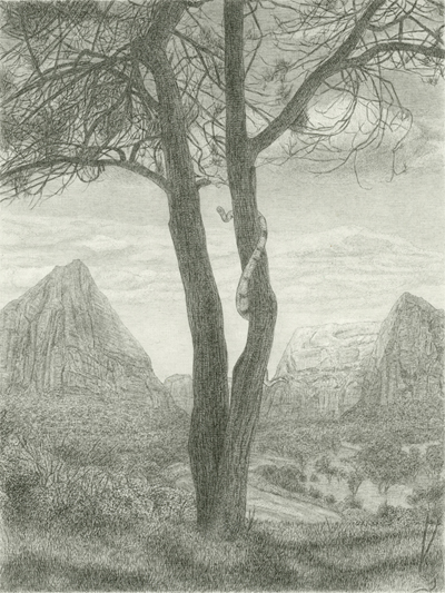
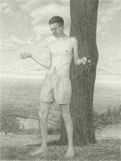
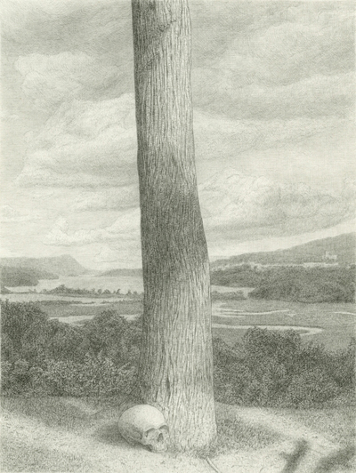
I rarely have time to blog these days, but I had to write a short post about Rob Matthew's beautiful show at Gallery Joe. I love his work. Go see it! It's only up until June 26th, and if you haven't seen a tree (or a snake, or a person) drawn by Rob Matthews, you haven't seen a tree (or a snake, or a person.)

The show is called "It Fills Us. We Arrange It." and details are here.


The show also includes another killer skull that I don't have an image of: he's made some beautiful white washy drawings on black paper that seem to float off the page. What a freaking genius.

Thursday, April 15, 2010

Trade

I'm excited about where my work is going these days. This is a large new drawing called Trade. It's on my website here.


Here are some details. The color in these images is pretty dramatically off, but it's the best I can get right now. The morning glories, below, are actually purple, and the pinks in the clouds on the right are far less salmony in person.


The main text says "Will Not (maybe, possibly, hopefully) Trade...


...Beauty


For (a secretive and obnoxious system of) Taxonomy."


On the bottom banner it says "Our (Eyes) Loves..."


Do Not Betray Us."


The text in this bubble says "The power of that first sunset or flower may fade, but must we throw the ocean out with the bathwater? We seek blossoms as a pure ide(ot)ation of pink, frightened of pollen and obsessed by bees..."


The planet in the top right says "A Vast and Paranoid Universe of Theories about Art", and the lower one says "Prestige Eats Independent Thought For Dinner."

Wednesday, February 03, 2010

Landing soon

I can't believe that the last time I wrote was in November- but then again, yes I can. I've been on two continents and in three states since then, and although I've got two more big drawings and one small one that are almost finished, there's no way I'm going to be able to work on them until February 16th. On that blessed day I will have finished moving my apartment and my studio in to a new, totally beautiful, enormous live-work space that I'm renting at a ridiculously low price from my fabulously generous landlord friend, who is also a terrific artist. (Who I'd name if I felt like having my home address on the internet...) I'm super lucky, and very grateful.

We arrived in Philadelphia in December and then spent most of the next month visiting relatives in Virginia and Austin. My mother, Margaret Simpson, and her partner Thom Drucker, run Slugfest Printmaking Workshop and Gallery, which is a fantastic place. They helped me finish up a print that I've been working on down there, and when I got back I signed off on another print that I made with Jim Stroud from Center Street Studios. That print, A Promise is a Promise, was sold to the Cornell University Museum of Art, and is included in Gallery Joe's next exhibition, which opens this Friday from 6-9. The show is up until February 27th. There are a lot of fabulous artists in the show- check it out: Astrid Bowlby, Emily Brown, Lynne Clibanoff, Christine Hiebert, Marilyn Holsing, Jeanne Jaffe, Mary Judge, Sharon Louden, Winifred Lutz, Rob Matthews, Linn Meyers, Kate Moran, Charles Ritchie, Stephen Robin, Mark Sheinkman, and Martin Wilner. I feel like lots of those names should have exclamation marks next to them.

When we got back to Philadelphia I started teaching again and began fixing up our new space. It's the classic artist's loft, which means that it has taken a fair amount of fixing up. Suffice it to say that no amount of lifting weights has ever managed to bring any semblance of a muscle to the surface of my sausagey arms, but painting my studio did it. The place is huge and wonderful, and once we are finally moved in, on February 16th, I'll get back to work.

Everyone's been asking me how it feels to be back in Philadelphia after being in Rome, and I have to admit that I was worried about the transition. I loved every day in Rome. I would move there in a second, if I could only learn to make Euros in some beautiful, efficient way. Say, out of spit, flour and food coloring. Since I can't, I had to come back- and when I was there, surrounded by fountains, Berninis and gelato, I thought Philadelphia would be a huge letdown- but it's not. I've always liked it here, and I still do. Philly's its own thing. It's a great, real, weird place. It's not pretty in February, but it's the perfect place to bunk in and make art.

And as for the transition, well, there's a lot to be said for being able to really speak a language. I did okay in Italian. I speak well enough that, with forethought, I can start a conversation or ask a question, and I have a pretty good accent. I can usually understand what people are saying, so it's not terrible, but for an Italian person talking to me is like making a cellphone call to the moon- communication can happen, but there's a ten minute pause before they get my reply. I LOVE that on this side of the ocean I can talk to strangers about whatever I want. On my second day in Philly I got in a forty-minute conversation with a crazy lady at the post office about her kids, her pets, her grandson's art, her grandson's feelings about his mom's slutty clothes, her daughter's dogs...It was fantastic.

And also? Philagraphika. Which more than enough of a reason to love being in Philadelphia right now. More on that later, you betcha, but in the meantime, in case it seems like I'm gratuitously promoting my mother's printmaking studio because she's, you know, my mommy, you could compare their gallery page to the Philagraphika artists page. Slugfest has shown half the people in Philagraphika. Which is another reason that Philagraphika rules. As does Slugfest. As does my mom.