Last week was amazing- I saw so much good art I'm set for life, and if someone would just give me a winning lottery ticket I'd move to New York in about half a second. (I love you Philly, but...dang.)

There was an amazing print show at the Brooklyn Museum called
Utagawa: Masters of the Japanese Print, 1770–1900. It was one of the best print shows I've seen ever. The Brooklyn Museum doesn't have the prints I liked online, but they do have some amazing Hiroshige images online for free here:
One Hundred Views of Edo.We all pretended to be zombies in the yellow light of Olafur Eliasson's
Take Your Time exhibition at MOMA. We didn't see the whole exhibition, but the hallway with the yellow light was our favorite part of his stuff we did see. The yellow lights did something strange: they sucked the color out of everything that wasn't yellow or blue. Every color besides blue looked like a shade of yellow. Blue looked like a creepy purple. Which made people like my mom, who is a blue-eyed blonde, look like a perfect zombie. Her clothes, hair and skin were various shades of sickly yellow and her eyes were a blazingly surreal purple. Super cool.
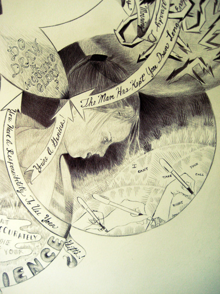
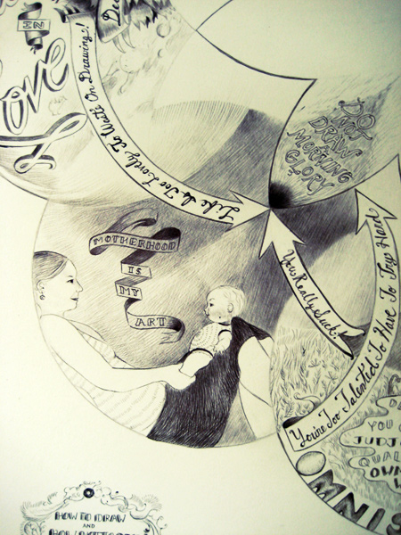
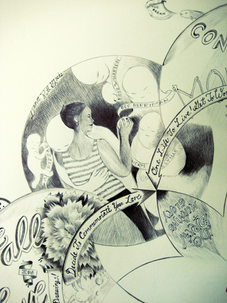
We all really loved the
Glossolalia: Languages of Drawing exhibition. Man, was that good. Martin Ramirez, Henry Darger, Tom of Finland, Raymond Pettibon...a whole bunch of amazing work was in that show. The following images are from the MOMA website; if you click the link above you can see many more great images from the exhibit.

Jockum Nordström. (Swedish, born 1963). Playtime for Dung-Hills. (2000). Pencil on paper, 17 3/4 x 24 3/8" (45.1 x 61.9 cm). Gift of the Friends of Contemporary Drawing. © 2008 Jockum Nordström

Jim Nutt. (American, born 1938). A Certain Distance Between Them. (1975). Ballpoint pen and pencil on paper, 10 x 13" (25.4 x 33 cm). The Judith Rothschild Foundation Contemporary Drawings Collection Gift. © 2008 Jim Nutt

Raymond Pettibon. (American, born 1957). No Title (Don't complicate...). 1987. Ink and gouache on paper, 24 x 18" (60.9 x 45.7 cm). Gift of the Friends of Contemporary Drawing. © 2008 Raymond Pettibon

Scottie Wilson. (Scottish, 1889-1972). Fantastic Flowers. n.d. Ink and crayon on paper, 14 1/8 x 10" (35.9 x 25.4 cm). Purchase
We also visited
Cannonball Press. The guys there make a whole bunch of different kinds of work, but some of their best stuff is these huge prints that are done collaboratively.

(click for larger image. So worth it.)
When we visited Cannonball Press the lovely printers showed us a bunch of their geniusy work and gave us prints!

Hold Please, by Mike Houston
The print they gave me is by Mike Houston. It, um, expresses ire about interoffice memos and includes a little bitter squirrely man saying "F.U." So of course I love it, and plan to hang it in my office at work.
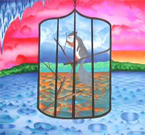
There's also a great print show in Philly, though, too, although unfortunately there's not much about it on the net. It's called
Curious and Commonplace: European Popular Prints of the 1800s, and it includes this fantastic image, which is really the least of it- everything in the show is incredible, I swear. But you'll have to trust me, because the Philly Museum website will only let me link to this dinky little image. But if you click it you can see it bigger!

We saw lots more art, but I'm just hitting the highlights because I'm so behind on this blog. I finished a new piece yesterday and hope to post it tomorrow, but in any case if you're near Philly or New York, run run run and see these shows! And go
buy some prints from Cannonball Press. They're great, funny, smart and and cheap. What's not to love?

Miss Fortune by Martin Mazorra.(Click for ordering info.)